10.4 Venetian Nudes in Five Muses on Mount Parnassus
Five Muses on Mount Parnassus (1650) in the Oranjezaal of Huis ten Bosch [20] is one of Lievens’ most ambitious paintings.1 Lievens was chosen as one of the eight best painters from The Netherlands to contribute to the grand transformation of the central cruciform space into a memorial hall for the recently deceased Frederik Hendrik (Prince of Orange), indicating that by this time Lievens was deemed an expert at grandiose history pieces.2 Frederik Hendrik and Amalia also owned some early works by Lievens.3 Even though Frederik Hendrik and Amalia did not own any Italian paintings, Venetianesque paintings from the Southern Netherlands were predominant in their collection, a group now also including Lievens’ Five Muses. Given the enormous popularity of Rubens across Europe, the Stadholder had surprisingly few works by the diplomat painter, perhaps due to an adverse political situation.4 The enormous scale of this eulogistic project, laced with historical and allegorical figures, mirrors similar series executed by Rubens for foreign royalty, such as his cycle of Maria de’ Medici (1575–1642). This explains the choice in artists by Jacob van Campen (1596–1557) and Huygens, who opted for some of the best followers of Rubens that painted in the same Venetian/Southern Netherlandish style, some of which also trained in his studio: Jordaens, Thomas Willeboirts Bosschaert (1613/14–1654), Theodoor van Thulden (1606–1669), and Pieter Soutman (1593–1657).5
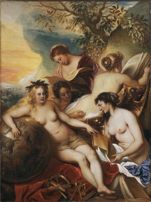
Lievens was assigned a spot on the west wall, depicting ‘De muysen besigh met sijn geboorte opte soecken’ (‘the Muses busy looking up his birth star’). Lievens’ composition showed five of the nine muses sitting on Mount Parnassus and formed a group with two paintings by Caesar van Everdingen (1616/1617–1678): The birth of Frederik Hendrik [21] and Four Muses and Pegasus [22]. The composition in the two muse paintings clearly relate to one another: the slope of Mount Parnassus continues from one painting to the other, the hairstyles and poses of several muses are very alike and both pictures are lit from the front, and slightly to the left.6 Lievens’ work had to be carefully attuned to and complement the neighbouring canvases, van Everdingen’s The birth of Frederik Hendrik and Four Muses and Pegasus.7
20
Jan Lievens
Five Muses on Mount Parnassus, 1650 (dated)
The Hague, Paleis Huis ten Bosch (Oranjezaal)

21
Caesar van Everdingen
The birth of Frederik Hendrik, c. 1649
The Hague, Paleis Huis ten Bosch (Oranjezaal)

22
Caesar van Everdingen
Four Muses and Pegasus, 1648-1650
The Hague, Paleis Huis ten Bosch (Oranjezaal)
Traditionally, the muses are only depicted nude within the context of their musical concert. In this case Lievens’ muses, although they are examining books and scrolls, are also painted nude to form a more coherent group with the four muses in van Everdingen’s pendant, strumming on their instruments,8 putting the female nude in the centre of attention in both canvases. At that time, lifelike rendering of human flesh was considered one of the most challenging ordeals for a painter from the time of Giorgio Vasari (1511–1574), who put Titian’s Danaë at the centre of the colorito-disegno debate in his The Lives of the Most Excellent Painters, Sculptors and Architects (1550).9 This debate discusses the two ways of painting embodied by Lievens and van Everdingen in the Dutch equivalent, ruw (rough) and net (neat), or, at the end of the 17th century, Rubenistes and Poussinistes.10 Lievens’ broad, spontaneous brushstrokes and pastuous paint application contrast with van Everdingen’s clear colours and detailed definition of the forms.11 The difference in the two approaches was meant to convey the inspiring effect of the art of painting: colorito was associated with a lifelike quality and sensuality, while disegno was thought to appeal primarily to the intellect.12
The ideas of Vasari and his contemporary Lodovico Dolce’s (1508/10–1568) Dialogo della Pittura (1557) are reflected in the works of five Dutch authors who wrote on Venetian painting: Karel van Mander (1548–1606), Gerardus Vossius (1577–1549), Jan de Bisschop (1628–1671), Samuel van Hoogstraten (1627–1678) and Joachim von Sandrart.13 These Dutch authors elaborate on what Lievens and his clients considered to be colorito, or ‘Venetian style’ through its antithesis to the Tuscan–Roman school, the full scope of which transcends the purpose of this article.14 When writing on Italian painting, van Mander translated parts of Vasari’s findings for his own book. In doing so, van Mander did stray from Vasari’s bias towards the Tuscan–Roman school and although van Mander valued both schools equally, he slightly favoured the Venetian school.15 It is possible that in juxtaposing van Everdingen’s disegno with Lievens’ colorito, van Campen aimed to illustrate van Manders’ idea that both styles were equally worthy and could coexist harmoniously.16 Evidently, these art treatises were a rich source of material on Italian art, highly valued by painters and art lovers in the 17th century, offering a valuable corollary to the Venetian art available to the Dutch viewer. Van Mander’s book even ranked fourth in the list of most frequently owned books by artists in Amsterdam.17 Not surprisingly, in his discussion of Italian art van Mander mainly referenced grand commissions for churches and palaces, thus to Lievens it could have been a great honour to compete with his Italian idols when painting large-scale pieces.18
Colorito painting encouraged a soft and fluid handling of paint as opposed to putting down hard and fixed boundaries between forms. Furthermore, it recognised the tactile qualities of paint and used its textural richness in an almost sculptural way.19 The Venetians treated their materials as the vocabulary to translate refinements of tone that had previously been elusive.20 In Dutch art theory, the term colorito and capturing refinements in tone were intrinsically linked to the nae ‘t leven (‘from life’) ideology, which inevitably was most used to describe flesh colour, that which gives the human figure life.21 ‘From life’, ‘wondrously lifelike’, ‘like reality’ are terms that can be found in van Mander’s and von Sandrart’s description of Titian’s, Giorgione’s and Bassano’s art.22 Inextricably linked with a good depiction of flesh is surface appearance, to which the terms vleesachtich and poeselich allude. Vleesachtich applies to the property of ‘fleshiness’, achieved by the texture and hue of all the parts of the body, and implies the ‘sheen of oils that augments the description of lustrous flesh’.23 Poeselich described the qualities of pliability, resilience, and softness of the paint surface marked by the brush and evoked by clever handling of malleable pigment.24
Although the two muse paintings are twins in terms of subject and composition, the works differ from one another in several pictorial and painterly aspects.25 Van Eikema Hommes and Speleers have already argued that the way Lievens painted The Five Muses was reminiscent of the painting technique of Titian.26 It would be fitting for Lievens to take inspiration from Venetian painters for his large nude painting. The female body has been a central motif in painting since the Renaissance and the realm of classical mythology lent itself perfectly to this pictorial subject. Venus was the most obvious deity to be depicted nude, but the subject of Diana at her bath, accompanied by her court of nymphs, would also become popular in Venetian painting in the early 16th century. Of all the nudes, it is the motif of the reclining female nude that has come to be associated most traditionally with Venetian painting.27 Titian’s Poesie series became the fundamental reference for further nude pictorial representations for his contemporaries and painters in centuries to come, like Rubens, and also Lievens.28
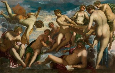
As referenced earlier, Lievens likely had numerous opportunities to see some paintings from the revolutionary Poesie series. When comparing Lievens’ painting to some of these, it becomes clear that he wasn’t just inspired by the colour palette and technical aspects, but that he also emulated compositions and poses.29 Rubens had a copy of Titian’s Diana and Callisto in his collection and Titian’s work was well known across Europe through engravings.30 For the figure of the commanding muse Urania, Lievens mirrored the pose of Diana, which makes it likely that Lievens knew this painting from a print [23-24]. Lievens painted the muse seen from the back with an elegant curve connecting her ribs to her hips, creating an inverted s-shape [25]. This same feminine line can be seen on the side of the companion holding the arrows in the foreground of Titian’s painting.31 Since Rubens did not slavishly copy Titian’s painting style, his painting can’t serve as a comparison beyond composition.32 However, it is probable that Lievens saw other nude paintings by Venetian painters, for example the Perseus and Andromeda by Titian [15], also part of the Poesie series, once in the collection of van Dyck, and The Muses by Tintoretto [10], once in the collection of Charles I. By drawing inspiration from Diana and Callisto for the composition, it seems Lievens wished to continue the legacy of the famous Venetian nude, which is affirmed by his technique.

23
Cornelis Cort after Tiziano
Diana discovers the pregnancy of Callisto, dated 1566
Amsterdam, Rijksmuseum, inv./cat.nr. RP-P-BI-6372

24
Jan Lievens, detail from Five Muses on Mount Parnassus.

25
Jan Lievens, detail from Five Muses on Mount Parnassus
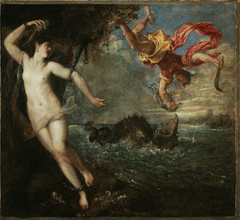
15
Tiziano
Perseus and Andromeda, 1554-1556
London (England), Wallace Collection, inv./cat.nr. P11
10
Tintoretto
The Muses, 1578
Hampton Court Palace (Molesey), Royal Collection - Hampton Court

26
Jan Lievens, detail from Five Muses on Mount Parnassus, showing the opaque fleshy parts and transparent edges

27
Jan Lievens, detail from Five Muses on Mount Parnassus, showing Lievens’ use of the weave as a pictorial tool
The Venetian technique or ‘colouration’ does not mean the choice of beautiful colours as it does the subtle combination in a contrast of light and dark. This blend should be achieved through sfumatura (fine shading that results in soft transitions), so that the figures adequately convey relief and three-dimensionality. Dolce refers to this as ‘rounding the figures’. In 16th- and 17th-century painting, a commonly used technique to achieve an effect of roundness and depth was to keep the outlines somewhat blurred,33 as can be seen further back in the pictorial space of Lievens’ painting. Like Titian, Lievens pushed this even further when modelling the muses in the foreground. For the fleshiest parts i.e. the protruding shapes, the paint was applied thickly, rendering the underlayer obsolete. Towards the contours, however, the paints are brushed out more thinly, gradually exposing more of the transparent brown underpaint as well as the red sketch lines and the canvas weave [26-27].34
This three-dimensional illusion of paint alludes to the well-known paragone debate, in which Titian eagerly took part. Despite the poor condition of Perseus and Andromeda35 — surface abrasion brings out the canvas weave more than the artist originally intended — one can clearly see the thicker fleshier parts and the thinned out paint towards the contour lines [28-29]. The term poeselich was consequently often used by van Mander to describe the chubby way of Italian painting, since it depended on the texture, hue, sheen and transparency of the oil paint, as well as a softness and clever handling of the paint surface.36
The dragging of brushes with a small amount of paint seems to have been one of Titian’s techniques for achieving the soft, broken contours that feature in so many of his later works.37 These broken contours were used to achieve further softness and poeselijckheyt, blending or ‘driving out’ the transitions between colours (verdrijven). This term is applied wherever delicate transitions were needed, especially in human skin.38 For Flaying of Marsyas, Titian even smeared the glazes for the flesh colours with his fingers in order to achieve the perfect gentle transitions from light to shade.39
In workshop practice, verdrijven referred to a light, sweeping brush movement to smoothly join separate colour zones and soften the surface appearance of depicted objects.40 This technique can be seen in the face of the muse shown in profile, that has been detailed with a fine contour line and has been fanned out with extreme care [30]. The contours are articulated with further prominent lines, however they hardly ever precisely delineate the figures [31-32].41 The outlines thus consist of several lines running partly parallel, partly over one another.42 The resulting broad, indistinct areas strongly recall the work of the late Titian and other Venetian painters,43 like Tintoretto. Having started as fluid underdrawings, the contours are often transformed into drawn paint strokes. In his painting The Muses, Tintoretto applied rough dry contours that overlap the edge of the body and the beginning of background [33-34].44 The broader areas of transition in Five Muses on Mount Parnassus are quite pronounced, since the painting was intended to be viewed from a distance.45

28
Tiziano Vecellio, Perseus and Andromeda, detail of Andromeda’s right shin, although the paint layers are abraded, it shows the thicker paint on the part of the shin closest to the viewer, and the thinness of the paint at the contours, showing the texture of the weave of the canvas (photo by the author)

29
Tiziano Vecellio, Perseus and Andromeda, detail of Andromeda’s thighs in raking light, clearly showing the more opaque paint layer on the highpoints of her thighs, with thinner paint layers in between the two legs and at the contours, showing the structure of the weave (photo by the author)

30
Jan Lievens, detail from Five Muses on Mount Parnassus

31
Jan Lievens, detail from Five Muses on Mount Parnassus, showing the added darker contour lines under the arm and on the shoulder of the muse seen from the back

32
Jan Lievens, detail from Five Muses on Mount Parnassus, showing Urania’s upper arm delineated by the double contour lines

33
Jacopo Tintoretto, detail from The Muses, showing the two muses on the far right. The dry and thin application of the added broad contour line over the shoulder and the back allows the underlying layer of paint, sky and skin, to shine through, creating a larger, indistinct area, similar to the contour line under the arm by Lievens above (photo by the author)

34
Jacopo Tintoretto, detail from The Muses of second muse on the right, clearly showing that even though the figures are delineated with dark contour lines, the overlap creates a hazed, overall blurred effect
Elements that contribute to vleesachtichheyt are the different textures, opacity and the sheen of oil paint that add to the lustrous depiction of flesh, since the important and most elusive aspect of skin is its simultaneously translucent and opaque quality. The use of glazes helps to add the dimension of depth through the skin. Characteristic of Titian’s work is the high variety of different textures, impastos, glazes and diverse levels of translucence within the same picture.46 In Perseus and Andromeda, his technique in Andromeda is markedly different from that of the rest of the painting. Titian returned again and again to make minor alterations, as well as to add scumbles and glazes once the previous paint had dried [35]. The finished painting therefore appears matt in some areas, and saturated and shiny in others.47 The Five Muses by Lievens alternates painting styles in a similar manner. To achieve different skin textures and shadow effects, Lievens varies between leaving part of the underpaint visible, using opaque browns, transparent brown glazes, adding black to the paint [36] and letting the underpaint shine through the upper skin coloured layers [37].48
The patchiness of colour application in flesh of the muse seen from the back, where he applied various yellow, orange and pinkish flesh colours side by side, only sporadically blending them into each other [38], is again reminiscent of the colorito way of painting.49 Lievens’ splotches blur into an almost even flesh tone from a distance, deliberately contrasting with the highly finished faces of the muses at the front.50 The patchiness of paint application is also referred to as the use of broken colour, which was particularly associated with the Venetians. In his late oeuvre, Titian used a rich, finely nuanced palette in which individual tones blend together almost seamlessly, especially for female nudes to keep the illusion of skin intact.51 For example, the rendering of Andromeda’s flesh lies between Titian’s realistic copy and his structural imitation of flesh. This technique demands the viewer’s active involvement to visually complete what the artist suggests.52 In these mythological pieces, Titian demonstrates a realism that seems to reflect the painter’s own touch and these images of nudes have sometimes been discussed in terms of a paragone of the senses, a comparison of the powers of sight, hearing and touch in the perception of beauty.53 The paintings invite the viewer to reach out and touch the nude flesh of the depicted body and the actual surface of the painting, combining the senses of sight and touch into one.54
In this particular painting, Lievens’ handling of paint alludes to many of the features that were at the time considered exemplary of the Venetian colorito or the ruwe way of working: visible brushwork; vague forms and contours; and the use of paints of various consistencies. Although Lievens’ image is highly worked, some passages have been left deliberately uncompleted: the two farthermost muses only consist of thin, loose brushstrokes on the transparent brown underpaint. The patchiness of colour and the varied handling of paint shows that Lievens was well acquainted with the style and technique of the Venetian masters.55 For this painting, it seems Lievens was inspired by Venetian art in general and that he referred compositionally and technically to the painting series that made the Venetian nude famous, the Poesie series by Titian. This way, Lievens referred to the tradition of the tactility of the nude. The contrasting handelingen of van Everdingen and Lievens, with disegno enticing the intellect and colorito appealing to lifelikeness and sensuality, make the visitor of the Oranjezaal drawn to Lievens’ nudes and invite them to touch by means of his poeseliche approach.

35
Titian, detail from Perseus and Andromeda, detail of Andromeda’s foot, showing the transparent glazes that have been used in between and on the outside of her toes (photo of the author)

36
Jan Lievens, detail from Five Muses on Mount Parnassus of Urania’s face, showing the darker half shadows around her mouth that were achieved by adding black paint to the skin coloured pigment

37
Jan Lievens, detail from Five Muses on Mount Parnassus, showing the shadowing on the dark-haired muse’s breasts, where Lievens let the underlayers shine through the top skin-coloured layers

38
Jan Lievens, detail from Five Muses on Mount Parnassus of the back of the muse, demonstrating the placement of yellow, pink and orange flesh tones next to each other, creating an overall smooth effect, especially when seen from afar
Notes
1 This case study is one of three that I discussed in my thesis and consists of the painting and the corresponding art theoretical concepts on Venetian art that best illustrates the argument of this article. The other two case studies were Allegory of Peace (1952), exploring the terms weerschijn, varieta and houding, and the Brinio, Leader of the Caninefates, Raised on a Shield (1661), focussing on lichtveerdig and prestezza brushwork, sprezzatura and macchie. Dieltiens 2018, p. 66–72; p. 80–90.
2 Blankert 2009, p. 22
3 Frederik Hendrik bought Student Reading by a Turf Fire, which was subsequently gifted to King Charles I, and Man in Oriental Costume (now in Potsdam), was mentioned in Huygens’ autobiography as belonging to the Stadholder’s collection. Dewitt 2006, p. 116–118. Van der Veen 1997, p. 88.
4 Van der Veen 1997, p. 92; p. 96.
5 Van der Ploeg/Vermeeren 1997, p. 55. Of course Lievens and Constantijn Huygens were well acquainted, which is likely also a contributing factor.
6 These similarities were not the result of a close collaboration between the two artists but were instructed to van Everdingen and Lievens by Jacob van Campen, as were the other painters of the ensemble. Van Eikema Hommes/Speleers 2011, p. 157.
7 DeWitt 2006, p. 207.
8 Ibid., p. 208.
9 Sluijter 2006, p. 202.
10 De Clippel 2007, p. 111.
11 Lievens worked in a smoother style in his portraits: Blankert 2009.
12 DeWitt 2006, p. 163.
13 Golahny 1984, p. 22. On a full description of each author’s description of Venetian painting: Dieltiens 2018.
14 Other useful references are poems, travel accounts and private journals. An early account is Aernout van Buchel (1565–1641), who travelled to Italy in 1587–88, and wrote Iter Italicum (Italian journey), an extensive account of the monuments he saw there, when he was already back in the Netherlands. He also collected notes primarily on Netherlandish artists, but also on Italians, in his ‘res pictoriae’ written after 1604. In these notes there are references to the Venetian artists Titian, Tintoretto, Veronese and Bassano. Most of these references are brief and vague, and there where he did include more in-depth descriptions of the art, he used Van Mander as his source. De Jong 2016, p. 123. Buchelius 1928, p. 40. Two Dutch travel diaries of Arnout Hellemans Hooft (1629–1680) and Vincent Laurensz van der Vinne (1628–1702) did not include descriptions of Venetian paintings or an indication of their reception of that art.On the colorito–disegno debate: Sluijter 2006, p. 195–219.
15 Golahny 1984, p. 26; p. 44.
16 Blankert 2009, p. 26.
17 Kattenberg/Baars 2014, p. 154. Golahny 1984, p. 66.
18 Blankert 2009, p. 20.
19 Golahny 1984, p. 2–3.
20 Pagnatti/ Pedrocco 1999, p. 81–83.
21 Sluijter 2006, p. 197. On Samuel Van Hoogstraten’ thoughts about this, Weststeijn 2008, p. 222.
22 Van Mander on Titian: ‘…: gebruyckende evenwel ten besten dat hij mocht, zijn dingen sonder teyckenen te schilderen nae t’leven, waernemende met den verwen uyt te beelden alles wat hy daer in sagh, t’zy hardt oft soet.’; ‘…wonderlijck levendich coloreren…’. On Giorgione: ‘…: wilde niet in’t wreck brenghen, als dinghen, die hy self nae t’leven hadde gheconterfeyt’. On Sebastiano del Piombo: ‘…: maer ghewende hem seer te conterfeyten nae ’t leven.’ On Bassano: ‘Zijn ghelockte Schapen, en ruyghe Geyten, Voghels, Visschen, Fruyten, materialen, Deed' hy nae t'leven, […]’. From: van Mander 1969, 174v.; 175r.; 115r.; 138r; 41r. Von Sandrart on Titian: ‘ganz natürlich und ähnlich/ fleischachtig und lebend’. On Giorgione: ‘Den Bildern Geist und Fleisch einzugiessen’. From: Von Sandrart 1675, S. 158; S. 90.
23 Melion 1991, p. 104.
24 Ibid., p. 104–105.Hessel Miedema is the pioneer in interpreting Dutch art theoretical terms and his reference translation of Karel van Mander’s Schilderboeck is indispensable: Miedema 1994. For a direct correlation between the art terms and painting practice: Miedema 2017.
25 On the complete comparison of these two paintings in terms of technique: Van Eikema Hommes/Speleers 2011.
26 Van Eikema Hommes/Speleers 2011.
27 Ilchman 2009, p. 175.
28 Among the Poesie are Danae (Museo del Prado, Madrid), Venus and Adonis (Museo del Prado, Madrid), Diana and Actaeon and Diana and Callisto (National Gallery of Scotland), Perseus and Andromeda (Wallace Collection, London), Death of Actaeon (National Gallery, London), Rape of Europa (Isabella Steward Gardner Museum, Boston). Ferino-Pagden 2008, p. 202. Ilchman 2009, p. 175.
29 Van Campen sent instructions to all the painters contributing to the Oranjezaal, consisting of a composition sketch and a description of the representation, as well as directions regarding the perspective, the painted architecture and light. Lievens was thus provided with basic outlines of the composition but was still able to have some freedom concerning the specific poses. Ploeg and Vermeeren 1997, p. 54. Eikema Hommes 2011, p. 295.
30 The Netherlandish engravers active in Venice wasted no time in translating 16th century Venetian painting into their work, attempting to render the light effects, atmosphere and texture, disseminating it across Europe. When they travelled, the work by Venetian painters was also often published by local printing shops. These prints made their way into the private collections of artists, such as Rembrandt. In his inventory under entry 0167 there was ‘Een ditto [boek] seer groot met de meest alle de wercken van Titian’ (‘a ditto [book] very large with most of the works by Titian’), in which engravings and woodcuts of landscapes would have been included, probably also a few original landscape drawings by Titian, as well a few copies after the master by Rembrandt himself. Golahny 1984, p. 106. The Montias Database of 17th century Dutch Art Inventories. Bikker et al. 2014.
31 The fact that Lievens also was inclined to depict figures with slightly tilted heads, seen from a three-quarter view is highly reminiscent of the elegant figures in not only this copy after Titian, but many other Venetian paintings.
32 Wood 2010, p. 44.
33 Van Eikema Hommes/Speleers 2011, p. 160. On the depiction of contours in the Oranjezaal: Van Eikema Hommes 2005.
34 Van Eikema Hommes/Speleers 2011, p. 161. Van Eikema Hommes et al. 2015.
35 Checa 2008, p. 63.
36 Noë 1954, p. 91.
37 Dunkerton et al. 2017, p. 34.
38 Lehmann 2007, p. 94.
39 Neumann 1962, p. 18.
40 Lehmann 2007, p. 94.
41 Van Eikema Hommes et al. 2015.
42 For his later large scale public commissions, it became a standard technique for Lievens to add final black contours to reinforce the darker sketch underneath the paint. Gifford 2009, p. 48–49.
43 Van Eikema Hommes/Speleers 2011, p. 162.
44 Ilchman 2009, p. 80.
45 That the handling in a given work should be modified in relation to the distance from which it is to be viewed was a key tenet of classical and Renaissance aesthetic, in which Titian, according to Vasari, excelled. Vasari 1965, p. 458, as mentioned in Nichols 2013, p. 150.
46 Bohde 2007, p. 26.
47 Lank 1982, p. 405–406.
48 Van Eikema Hommes et al. 2015.
49 Ibid.
50 Van Eikema Hommes/Speleers 2011, p. 162.
51 Obenthaler 2008, p. 118.
52 Bohde 2007, p. 26.
53 Ilchman 2009, p. 180.
54 Ibid., p. 181.
55 Van Eikema Hommes/Speleers 2011, p. 162.